|
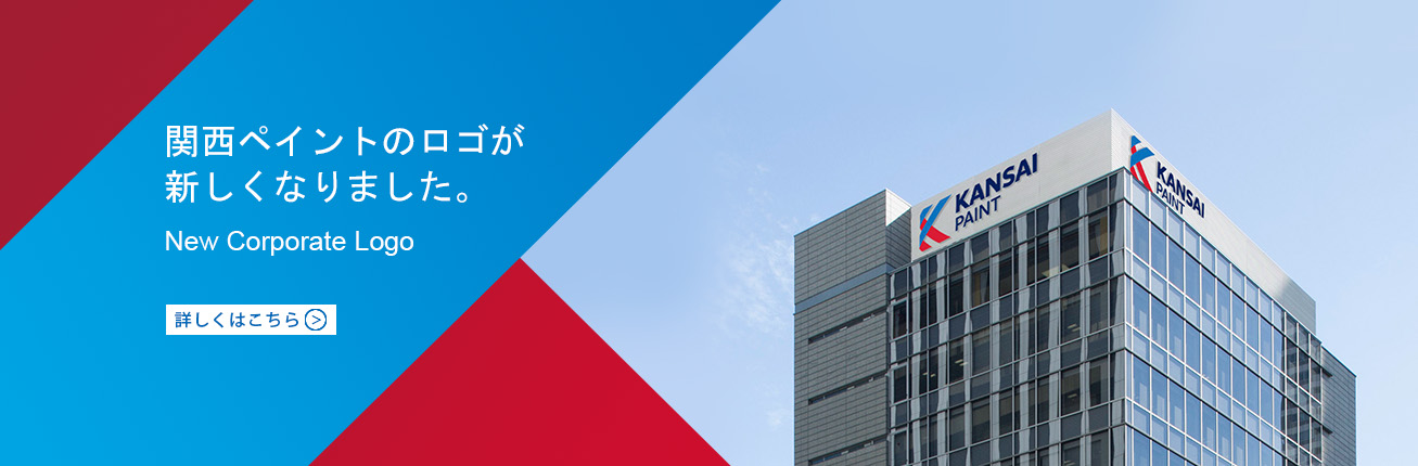
We are pleased to unveil our new corporate brand logo created in celebration and commemoration of our 100th anniversary!
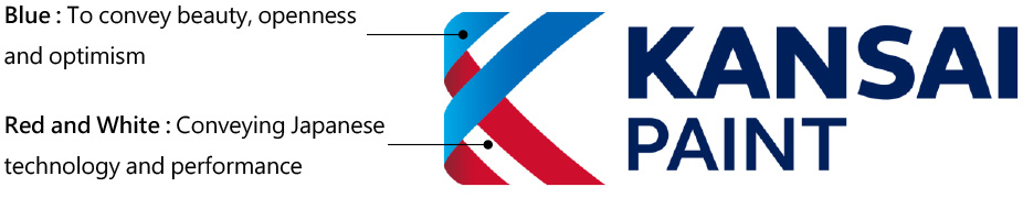
"Blue" connotes integrity, accountability, and respect, while "Red and White" connote superior Japanese technology, performance, and challenge. These elements are what form the "K" of the Kansai Paint Group. This integration expresses the Kansai Paint Group as a partnership based on mutual respect.
Our brand idea of "designed to last" is also a timeless reflection of the Kansai Paint Group, for we will strive to provide beauty through colours and ceaselessly find solutions to embrace everyone's living style, while being always sincere, open, and positive. This is our bold statement of creating lasting values that please. To us, this is becoming an essential element that supports the development of people and society.
|